What Makes an Erotic Book Cover
Aug. 8th, 2025 04:46 pmMori: After the end of my real-life bar graphing bacchanalia (lying on the floor, surrounded by books with tits and ass on the cover), I found myself having one of those 1AM conversations with my headmates: what makes a book cover truly EROTIQUE? What is that je nais se quoi and other fancy French words that give it the oomph?
I went and took a survey of my headmates of what they each considered "the most erotic book cover ever", and go figure, only ONE of them qualified for my stupid bookgraphing project. Here are the results! (Also, spoilers for the books involved.)
My choice was Ver's comic, Sacred Bodies:
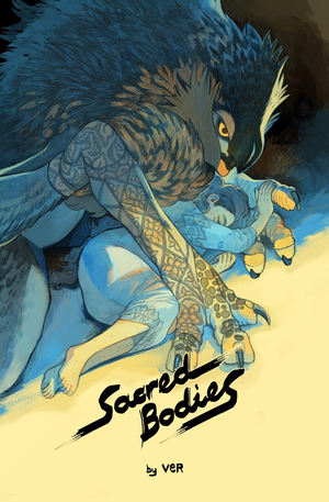
Why? Sacred Bodies is all about two people who are deviant or obscene by the standards of their local societies, and they've embarked on a marriage of convenience because of it. Though their marriage is not sexual, they find an intimacy in embracing each other's forbidden sides, both of which are symbolically represented on this cover, through their poses and how they touch. That Tolpan (bird) is wearing the embroidered sleeves that Dualayim (woman) made for them, the way Dualayim is curled and unafraid... this cover says everything about where these two characters come from and how they've come together, and the colors of gold (for sunlight, the above) and indigo (for the dark, the below) are all thematically relevant for the sunny Spire above, where they live, and the forbidden primitive urges of the dark Valley below. (The whole book is like this. Every color and detail is carefully thought out and chosen. We will be studying this work for years to come.)
Rawlin, meanwhile instantly chose the vulva photo book Femalia.

Rawlin: I chose it because while I'm sure the cover image was chosen to avoid censorship, so that it could be sold, it at the same time flaunts that censorship by expressing the beauty and grace of the human body. Despite the limits placed on it, it says what it is about with one simple image, the ideas that the body is beautiful and deserves to be recognized on its own merits, not only in a sexual context. It may not be a sexual image, but to me, it's the most erotic there is.
Mori: Mac chose a photo book too, Michael A. Rosen's Lust and Romance:

Mac: I like it because even though in the broad strokes, it could be any couple, just the way she's biting her lip makes it this couple. It tells you a lot about their relationship, just in that one picture! Cool, right?
Mori: Rogan went, "is it super gauche of me to say one of my own books? Because it's Found Wanting." (Yes, Rogan, it's super trashy, but we all trashy bitches out here, I ain't judging.)
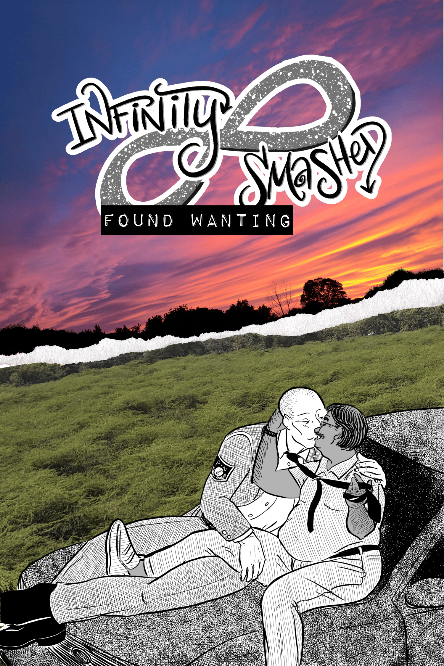
Rogan: I'm not going to say why because it just seems really fucking rude to trumpet your own book cover even if it really does it for me, so I'M CHEATING AND SAYING NOTHING!
Mori: Boo! Coward!
Miranda's choice was Yajuu no Kareshi ha Watashi no Nozomi ga Jissai ni Mieru (or, My Monster Boyfriend Can See My Feelings), by Nao Shizuka X Shesha. The creators have requested nobody scan or upload images of it, so I'll describe the back cover, which was her contender, more so than the front: in shades of pink and white, it shows the open, fanged mouth of the titular monster boyfriend, his jaw being stroked by his human girlfriend, whose hand he holds by the wrist. That's all that's visible: jaw, hands.
Miranda: I chose it because in this one simple image of hands and jaw, so much is communicated about these two characters specifically--what they want, how they relate to each other, what the book will contain. The color is also well chosen, because the comic (mostly in black and white) uses pink to express the human girlfriend's desires, which the "monster boyfriend" can perceive, feel, and interact with (and does, throughout the story). I consider it a masterpiece of telling the most possible information with the simplest possible image, comics at its finest!
Mori: So you see, with the exception of Rawlin's choice, all the others got their power from the specificity of the relationship dynamic involved. None of these covers could've been about anyone but the people on them.
Rogan: Yeah, a bunch of romance or porno covers (even for works I like!) can be kinda generic. How many jokes have you heard about the romance cover with a strapping shirtless Fabio guy holding a beautiful woman? The dude might wear different clothes (frilly open shirt for Regency, kilt for Highland, jeans and boots for cowboy...) but there's not really any idiosyncrasy that makes them stand out, even if the guy actually looks like the character in the book. The guy could be anybody! Now, admittedly part of that is because when you're a publisher cranking out books by the bushel, you need art quickly, and the only way to get the amount of art you need that fast is to be generic, but still.
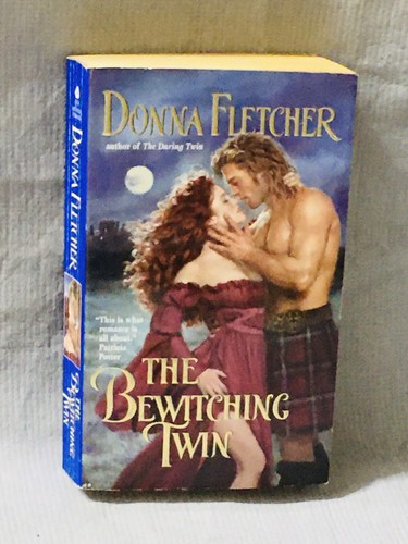
(This is the Rogan Highlander Romance Novel that Mac owned for years, because it was the easiest example we could think of for this. According to Mac, it IS an accurate depiction of Alys, the heroine, at least, but it still looks like it could kinda be ANY Highlander romance novel. There's nothing incompetent about how the cover is done, it just doesn't have much specificity.)
Mori: I also don't think it's a coincidence that with the exception of Femalia again, all of them use color pretty significantly too. Sacred Bodies is forever contrasting gold and orange against blue and black, reflecting that which is shown in the light and the hidden things of the dark. Yajuu no Kareshi/My Monster Boyfriend uses pink to show empathic pleasure. Michael A. Rosen does all his photo work in black and white, relying on the warmth and humanity of the participants to bring "color" to the works. And Rogan, well, he chose to splash a rainbow sunset all over Found Wanting for a reason.
Rogan: I also chose years back to make all Infinity Smashed covers a paper rip showing photos of two very different locations (the Found Wanting sky is from above my apartment a few housings ago, the green a place in Gujurat, where Bob is from and which is relevant to their story arc's end, beyond the book) and with the figures in black and white hand-drawn art. This worked to my artistic strengths and weaknesses at the time, but also ended up showing how Infinity Smashed sprawls from the purely created medium of print and paper to the very real lives we've had, even though the books themselves are fiction.
All works of art are products of the limitations of the artists, their time, skill, money, tools, and the size of the page. A good artist deals with these limits with grace. (Every Frame a Painting does a great job of discussing this kind of discipline in the context of film cartoons in "Chuck Jones - the Evolution of an Artist"!) Your book might be 5"x7.5" or 8.5"x11", but there's only so many things you can fit on it. None of our choices were Risograph printed, but Riso requires different considerations than digital or offset. It matters less what you have than how well you use it!
Rawlin: Yes! Femalia's cover is, I suspect, largely a result of working under those limitations. It is a book of vulva photography, but you can't display a book with a vulva on the cover, even though the book itself was created to fight that enforced ignorance, and so they are forced to choose a visual symbol that simultaneously bows to its limitations but also gracefully refutes them.
Rogan: When you're making a book cover, part of the craft is cabling together so many disparate parts (color, characters, lettering, themes) into one image that communicates as much as possible, as simply as possible, all while dealing with those limits. It's a lot to keep track of!
Mori: Yeah, and the books we chose do this "cabling" really well. Sacred Bodies is especially dense in how many layers it puts into everything, including its cover: color, wardrobe details, character positioning... everything twines together really satisfyingly. Ver, the creator, clearly put a lot of planning and thought into this work; you don't make something like this by accident.
Rogan: What I find interesting is how NONE of our covers, except Mac, made it on the bookgraph list. His choice was the only one with any nudity at all!
Mori: Well, there's a reason I used "erotic" when querying you guys. ...that and Rawlin gets nitpicky about the difference between erotic and sexual and ain't no way I could've arm-twisted her into choosing the SEXIEST book cover.
Rawlin: they are very different things.
Rogan: Well, I think it comes under that "limitations" thing I mentioned. I don't think it's a coincidence that all of these works are self-published, with the exceptions of Femalia (which was printed by sex toy shop Good Vibrations's publishing arm, and thus had its own built-in places to sell) and Lust and Romance (which was printed by Last Gasp, a counterculture and underground comics publisher). It's hard to publish something erotic, period, never mind queer shit or monsterfucky stuff.
Rawlin: Also, the erotic by nature requires vulnerability, which makes it uncomfortable. Something can be extremely sexual without being erotic at all, while Sacred Bodies (and, I'd argue, the cover of Femalia) are extremely erotic without being sexual.
Rogan: yeah, it's why some people react so incredibly wildly to ASMR; they sense the weird intimacy of it, and it makes them so uncomfortable that they think they must be watching some really far-out kinky sex thing, because they truly can't understand why a Russian lady folding towels would otherwise make them so viscerally upset.
Rawlin: Vulnerability is part of these covers. In the ones with people on them, I think the vulnerability is obvious--the woman's smallness in Sacred Bodies, the touch in Yajuu no Kareshi/My Monster Boyfriend, the bodily contact in Lust and Romance. With my choice, I think it's less obvious, but it's still there. Perversely, a nude vulva is a vulnerable display, or can be, because it is so rarely shown outside of sexual or medical contexts.
Mori: Having seen the amount of pussy-smashing in the pornos Mac and Rogan own, even when it's getting fucked, there isn't really many times I see a vulva being treated as like, an artistic subject that's worth savoring all by itself. It's just a hole that something is going into, the tunnel for the train. It becomes generic, lacking in its own individual features.
Mac: It's a damn shame too.
Rawlin: Yes! To merely show vulvas, for no other reason than to showcase their anatomy, grace, and beauty, becomes vulnerable because of the social context in which it takes place. Even if the subjects themselves didn't feel vulnerable, I feel vulnerable looking at them!
Mori: You can call it a pussy, hon.
Rawlin: No, I cannot.
Mac: Okay, but all this talk makes it sound like we all went, "Oh yeah, we chose these covers because they're all artistic," and ignores that we all thought they were the hottest things we'd ever seen. We weren't THINKING about the artistic merit or whatever, it was that we thought they were hot! But the stuff we found hottest wasn't the stuff people might think was "obviously" hot, you know?
Mori: Well, don't the artistic power help boost WHY they're hot? Ain't none of y'all chose "bad art" covers. There might be "good art" covers we don't find hot, but I think that we chose what we did proves it's not just a matter of kinks or "this is the hottest person on earth, so the cover showing them must be the hottest cover on earth." Clearly even when we're in hornbrain, we're noticing it!
Rogan: I blame that on us being a cartoonist for a living. We can't NOT notice it anymore. And I think it's a special kind of satisfying to see the kinks line up so well WITH the craftsmanship, so they boost each other.
I went and took a survey of my headmates of what they each considered "the most erotic book cover ever", and go figure, only ONE of them qualified for my stupid bookgraphing project. Here are the results! (Also, spoilers for the books involved.)
My choice was Ver's comic, Sacred Bodies:
Why? Sacred Bodies is all about two people who are deviant or obscene by the standards of their local societies, and they've embarked on a marriage of convenience because of it. Though their marriage is not sexual, they find an intimacy in embracing each other's forbidden sides, both of which are symbolically represented on this cover, through their poses and how they touch. That Tolpan (bird) is wearing the embroidered sleeves that Dualayim (woman) made for them, the way Dualayim is curled and unafraid... this cover says everything about where these two characters come from and how they've come together, and the colors of gold (for sunlight, the above) and indigo (for the dark, the below) are all thematically relevant for the sunny Spire above, where they live, and the forbidden primitive urges of the dark Valley below. (The whole book is like this. Every color and detail is carefully thought out and chosen. We will be studying this work for years to come.)
Rawlin, meanwhile instantly chose the vulva photo book Femalia.
Rawlin: I chose it because while I'm sure the cover image was chosen to avoid censorship, so that it could be sold, it at the same time flaunts that censorship by expressing the beauty and grace of the human body. Despite the limits placed on it, it says what it is about with one simple image, the ideas that the body is beautiful and deserves to be recognized on its own merits, not only in a sexual context. It may not be a sexual image, but to me, it's the most erotic there is.
Mori: Mac chose a photo book too, Michael A. Rosen's Lust and Romance:
Mac: I like it because even though in the broad strokes, it could be any couple, just the way she's biting her lip makes it this couple. It tells you a lot about their relationship, just in that one picture! Cool, right?
Mori: Rogan went, "is it super gauche of me to say one of my own books? Because it's Found Wanting." (Yes, Rogan, it's super trashy, but we all trashy bitches out here, I ain't judging.)
Rogan: I'm not going to say why because it just seems really fucking rude to trumpet your own book cover even if it really does it for me, so I'M CHEATING AND SAYING NOTHING!
Mori: Boo! Coward!
Miranda's choice was Yajuu no Kareshi ha Watashi no Nozomi ga Jissai ni Mieru (or, My Monster Boyfriend Can See My Feelings), by Nao Shizuka X Shesha. The creators have requested nobody scan or upload images of it, so I'll describe the back cover, which was her contender, more so than the front: in shades of pink and white, it shows the open, fanged mouth of the titular monster boyfriend, his jaw being stroked by his human girlfriend, whose hand he holds by the wrist. That's all that's visible: jaw, hands.
Miranda: I chose it because in this one simple image of hands and jaw, so much is communicated about these two characters specifically--what they want, how they relate to each other, what the book will contain. The color is also well chosen, because the comic (mostly in black and white) uses pink to express the human girlfriend's desires, which the "monster boyfriend" can perceive, feel, and interact with (and does, throughout the story). I consider it a masterpiece of telling the most possible information with the simplest possible image, comics at its finest!
Mori: So you see, with the exception of Rawlin's choice, all the others got their power from the specificity of the relationship dynamic involved. None of these covers could've been about anyone but the people on them.
Rogan: Yeah, a bunch of romance or porno covers (even for works I like!) can be kinda generic. How many jokes have you heard about the romance cover with a strapping shirtless Fabio guy holding a beautiful woman? The dude might wear different clothes (frilly open shirt for Regency, kilt for Highland, jeans and boots for cowboy...) but there's not really any idiosyncrasy that makes them stand out, even if the guy actually looks like the character in the book. The guy could be anybody! Now, admittedly part of that is because when you're a publisher cranking out books by the bushel, you need art quickly, and the only way to get the amount of art you need that fast is to be generic, but still.
(This is the Rogan Highlander Romance Novel that Mac owned for years, because it was the easiest example we could think of for this. According to Mac, it IS an accurate depiction of Alys, the heroine, at least, but it still looks like it could kinda be ANY Highlander romance novel. There's nothing incompetent about how the cover is done, it just doesn't have much specificity.)
Mori: I also don't think it's a coincidence that with the exception of Femalia again, all of them use color pretty significantly too. Sacred Bodies is forever contrasting gold and orange against blue and black, reflecting that which is shown in the light and the hidden things of the dark. Yajuu no Kareshi/My Monster Boyfriend uses pink to show empathic pleasure. Michael A. Rosen does all his photo work in black and white, relying on the warmth and humanity of the participants to bring "color" to the works. And Rogan, well, he chose to splash a rainbow sunset all over Found Wanting for a reason.
Rogan: I also chose years back to make all Infinity Smashed covers a paper rip showing photos of two very different locations (the Found Wanting sky is from above my apartment a few housings ago, the green a place in Gujurat, where Bob is from and which is relevant to their story arc's end, beyond the book) and with the figures in black and white hand-drawn art. This worked to my artistic strengths and weaknesses at the time, but also ended up showing how Infinity Smashed sprawls from the purely created medium of print and paper to the very real lives we've had, even though the books themselves are fiction.
All works of art are products of the limitations of the artists, their time, skill, money, tools, and the size of the page. A good artist deals with these limits with grace. (Every Frame a Painting does a great job of discussing this kind of discipline in the context of film cartoons in "Chuck Jones - the Evolution of an Artist"!) Your book might be 5"x7.5" or 8.5"x11", but there's only so many things you can fit on it. None of our choices were Risograph printed, but Riso requires different considerations than digital or offset. It matters less what you have than how well you use it!
Rawlin: Yes! Femalia's cover is, I suspect, largely a result of working under those limitations. It is a book of vulva photography, but you can't display a book with a vulva on the cover, even though the book itself was created to fight that enforced ignorance, and so they are forced to choose a visual symbol that simultaneously bows to its limitations but also gracefully refutes them.
Rogan: When you're making a book cover, part of the craft is cabling together so many disparate parts (color, characters, lettering, themes) into one image that communicates as much as possible, as simply as possible, all while dealing with those limits. It's a lot to keep track of!
Mori: Yeah, and the books we chose do this "cabling" really well. Sacred Bodies is especially dense in how many layers it puts into everything, including its cover: color, wardrobe details, character positioning... everything twines together really satisfyingly. Ver, the creator, clearly put a lot of planning and thought into this work; you don't make something like this by accident.
Rogan: What I find interesting is how NONE of our covers, except Mac, made it on the bookgraph list. His choice was the only one with any nudity at all!
Mori: Well, there's a reason I used "erotic" when querying you guys. ...that and Rawlin gets nitpicky about the difference between erotic and sexual and ain't no way I could've arm-twisted her into choosing the SEXIEST book cover.
Rawlin: they are very different things.
Rogan: Well, I think it comes under that "limitations" thing I mentioned. I don't think it's a coincidence that all of these works are self-published, with the exceptions of Femalia (which was printed by sex toy shop Good Vibrations's publishing arm, and thus had its own built-in places to sell) and Lust and Romance (which was printed by Last Gasp, a counterculture and underground comics publisher). It's hard to publish something erotic, period, never mind queer shit or monsterfucky stuff.
Rawlin: Also, the erotic by nature requires vulnerability, which makes it uncomfortable. Something can be extremely sexual without being erotic at all, while Sacred Bodies (and, I'd argue, the cover of Femalia) are extremely erotic without being sexual.
Rogan: yeah, it's why some people react so incredibly wildly to ASMR; they sense the weird intimacy of it, and it makes them so uncomfortable that they think they must be watching some really far-out kinky sex thing, because they truly can't understand why a Russian lady folding towels would otherwise make them so viscerally upset.
Rawlin: Vulnerability is part of these covers. In the ones with people on them, I think the vulnerability is obvious--the woman's smallness in Sacred Bodies, the touch in Yajuu no Kareshi/My Monster Boyfriend, the bodily contact in Lust and Romance. With my choice, I think it's less obvious, but it's still there. Perversely, a nude vulva is a vulnerable display, or can be, because it is so rarely shown outside of sexual or medical contexts.
Mori: Having seen the amount of pussy-smashing in the pornos Mac and Rogan own, even when it's getting fucked, there isn't really many times I see a vulva being treated as like, an artistic subject that's worth savoring all by itself. It's just a hole that something is going into, the tunnel for the train. It becomes generic, lacking in its own individual features.
Mac: It's a damn shame too.
Rawlin: Yes! To merely show vulvas, for no other reason than to showcase their anatomy, grace, and beauty, becomes vulnerable because of the social context in which it takes place. Even if the subjects themselves didn't feel vulnerable, I feel vulnerable looking at them!
Mori: You can call it a pussy, hon.
Rawlin: No, I cannot.
Mac: Okay, but all this talk makes it sound like we all went, "Oh yeah, we chose these covers because they're all artistic," and ignores that we all thought they were the hottest things we'd ever seen. We weren't THINKING about the artistic merit or whatever, it was that we thought they were hot! But the stuff we found hottest wasn't the stuff people might think was "obviously" hot, you know?
Mori: Well, don't the artistic power help boost WHY they're hot? Ain't none of y'all chose "bad art" covers. There might be "good art" covers we don't find hot, but I think that we chose what we did proves it's not just a matter of kinks or "this is the hottest person on earth, so the cover showing them must be the hottest cover on earth." Clearly even when we're in hornbrain, we're noticing it!
Rogan: I blame that on us being a cartoonist for a living. We can't NOT notice it anymore. And I think it's a special kind of satisfying to see the kinks line up so well WITH the craftsmanship, so they boost each other.
no subject
Date: 2025-08-08 11:08 pm (UTC)no subject
Date: 2025-08-08 11:08 pm (UTC)no subject
Date: 2025-08-08 11:09 pm (UTC)no subject
Date: 2025-08-08 11:09 pm (UTC)no subject
Date: 2025-08-08 11:10 pm (UTC)no subject
Date: 2025-08-09 05:04 am (UTC)One of my favorite romance authors, Courtney Milan, used edited stock photos for her self-published covers for years. They weren't even accurate depictions of the heroine most of the time. Then, when she started writing characters of color (she's Chinese American), she had to switch to hiring models for her cover photos, because — she's said this publicly — she could not find enough stock photos of women of color.
Ooh, I love your point about vulnerability. That's my favorite part of every story: the moment when the character's emotions can no longer be hidden. (I saw a performance of Much Ado About Nothing recently, and the comedy was as funny as ever, but what took my breath away was Hero's shock and grief when Claudio accuses her; Benedict's raw sincerity when he confesses his love and his helplessness when Beatrice demands that he murder Claudio; Claudio's horror when he finds out Hero is innocent.) I think a lot of romances use sex scenes as kind of a way to get the characters to reveal themselves to each other.