Entry tags:
All Narrators are Unreliable: Comics and the Depiction of the Psyche
All Narrators are Unreliable: Comics and the Depiction of the Psyche
Series: Essay
Summary: Comics’ lack of objectivity, and their ability to visually mash physical and psychological realities together, make them great for depicting the mind.
Word Count: 2800
Notes: A rough transcription of a lecture I gave to Hillary Chute’s Graphic Medicine course at Northeastern University on April 14, 2022 and originally posted for my Patreon folks in... May? Includes images with foul language, Japanese homophobic slang, and naked girls, but nothing worse than you’d see in an art museum. Images are included as illustration, not endorsement.
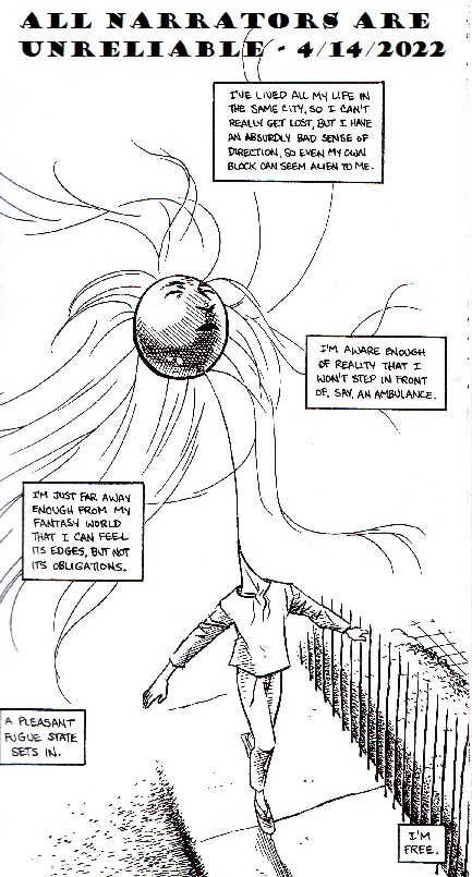
Carla Speed McNeil’s Finder: Dream Sequence, pg. 87. (2011)
Hello, everybody! We are LB Lee, we make mental health comics, and we’re multiple, so our pronouns are going to be a mess.
For a lot of people, multiplicity is this weird, alien concept. It’s hard for them to wrap their heads around. My job is to take them into my world, to make it seem ordinary and understandable, and comics are great for that! Lack of realism is usually a criticism, but comics’ lack of objectivity makes it the perfect medium for sharing psychological experience through visual art.
When we watch a live-action movie, we assume that what we are seeing is true and real. The camera is presumed to be an unbiased, objective observer, and when it isn’t—like in A Beautiful Mind—the audience is usually surprised. Comics aren’t like that. We know from the get-go that what we’re looking at may not be a one-to-one reflection of reality. It’s obvious; in real life, we aren’t surrounded by bubbles containing our speech or thoughts!

Adam Warren’s Empowered, vol. 4, page 128. (2007)
Thought bubbles have been out of vogue for a while, but these humble balloons deserve more credit. As visual, external representations of individual, invisible psychological experiences, thought bubbles are the core of a lot of the coolest psychological tricks in comics! This one is just a simple gag, but elsewhere in the book, we also get this telepathic character, unable to stop herself from mentally blurting out inconvenient truths. How do her parenthetical asides and differing bubble shapes affect the experience?
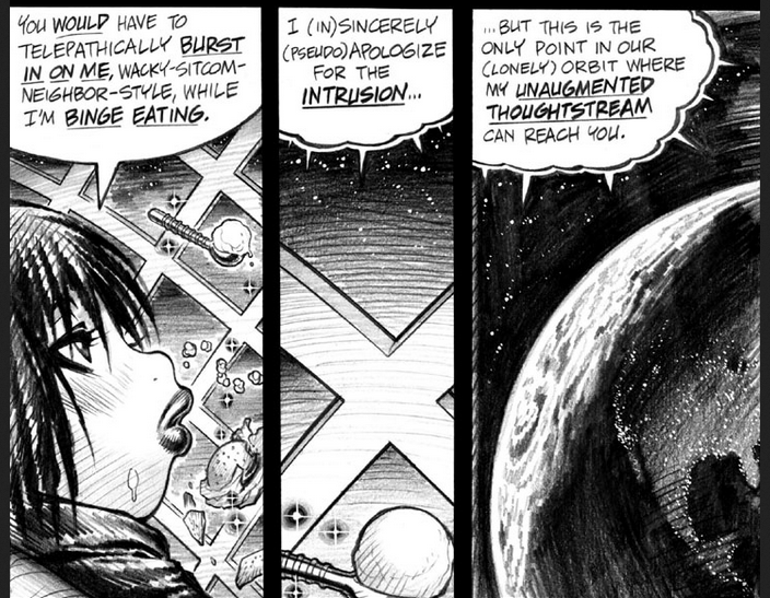
Adam Warren’s Empowered, vol. 4, page 101. (2007)
Maybe that’s a little too subtle. These thought bubbles aren’t too far removed from speech. Let’s try this one from volume 10. Just pause here to take it in.
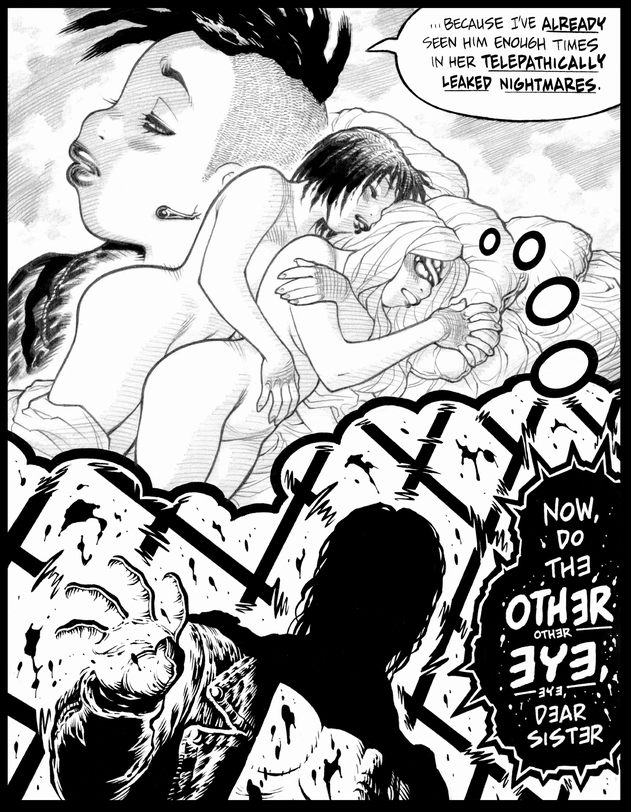
Adam Warren’s Empowered, volume 10, pg. 169. (2017)
Here, we have a depiction of a nightmare being shared via thought bubble, and the guy in the nightmare has his own speech/thought bubble, all black and distorted to show how viscerally “wrong” he is. Even the background is warping around him, and the stark black and white artwork in the dream bubble makes it clear we’re on a different layer of reality. And very little of this needs explaining—you know just by looking at one page/panel.
In volume 11, Warren takes it even further by removing the bubble entirely and showing this guy from his own point of view. We readers get to see the ghost of who he was, trapped in the shell of what he’s become, distorting everything he says and does. This panel and dialogue isn’t witnessed by any of the characters; it is purely for the reader, giving us as inside look at an otherwise horrifying, one-note evil character. Warren is less interested in what this character does than why and how he got to be this way.
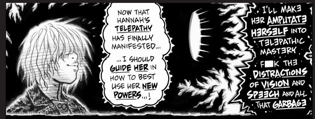
Adam Warren’s Empowered, vol. 11, page 186. (2019)
I call this a perspective of “inside looking out,” rather than “outside looking in.” It is hugely important for building psychological understanding and compassion. Prose can do it too, but through language, rather than visuals.
Probably the most elaborate version of the speech/thought bubble I’ve seen is this one from Osamu Tezuka’s Black Jack. Look at it! (And don’t forget to read it in Japanese order, from top to bottom, right to left.)
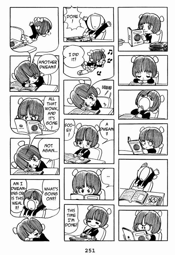
Osamu Tezuka’s Black Jack, vol. 2, pg. 251. (2008)
What an elegant, entertaining way to show looping dreams of waking up! Thanks to the page layout (and Japanese reading order) the reader doesn’t realize the character is dreaming until she does, over and over again. And you aren’t confused as to whether she’s still dreaming in future pages, because the whole sequence is contained within the same page, with a concrete beginning and end. I’ve read other comics where the loop spreads across multiple pages, and since it lacks clear beginning or end, the reader is left uncertain as to when the dream loop stops. (Though, depending on the creator’s goal, that uncertainty and discomfort might be the point.)
The next obvious step is to remove the thought bubble entirely, letting the thought or experience float without a clear barrier. How does that effect the message? These panels that use it very subtly. Depending on your screen contrast, you may not even see the wolf jaws in the second panel, closing around the character’s head. (In the web version, the wolf jaws are apparently done in red, helping them stand out more, but I couldn’t get my hands on that, so you get the crummy scan from my paper copy. Sorry.)
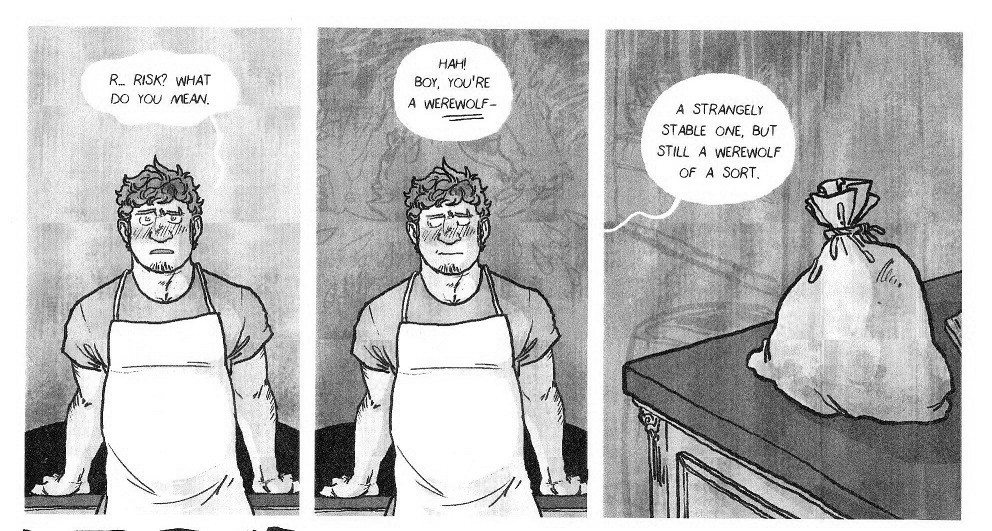
Mancameron’s Bad Magik, chapter 1. (n.d)
We all know that those wolf jaws do not literally exist, even if they aren’t walled off in a bubble. They’re barely visible, blended into the gray tones of the background, representing a nagging feeling, a free-floating anxiety, a narrowing of options, not a clear verbal thought or a cinematic image. It’s a very different effect, emotionally.
That moment is played for drama. Played for comedy, and way less subtle, is this gag, which requires a little bit of explanation and translation from Japanese. (Read this too in Japanese order, and apologies for the poor quality scanlation; the professional translation is long out of print and I couldn’t get my hands on it in time.)
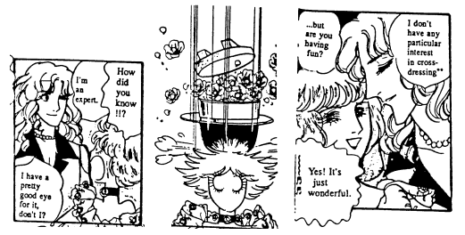
Yasuko Aoike’s From Eroica With Love, volume 2, chapter 4, page 40. (1978)
A rice pot (or “okama”) is Japanese slang for an effeminate gay man, transvestite, or trans woman, while roses (or “bara”) is old-fashioned slang that roughly translates to “pansy” in Japan. (In English-speaking online worlds, the word means something very different.) In other words, this character has just been clocked and realizes it.
Here, the psychological effect isn’t hidden away in the background, but even though the rice pot full of roses is drawn just like all the “real” things in the panels, we still know it’s figurative. It has no lasting effect, isn’t mentioned by any of the characters, and disappears as suddenly as it arrives. And even without the cultural context, an American might be familiar enough with the idea of the light-bulb (or the anvil) over someone’s head to guess roughly what they’re seeing. A more subtle, wolf-jaw styling wouldn’t work; this is not a subtle realization! It hits like a stack of bricks. But we, the readers, still know that it exists only psychologically—at least, as long as we know what the symbol means. As I recall, the official translation didn’t bother to explain the joke, which must have been perplexing for context-free readers.
Both From Eroica With Love and the print version of Bad Magik rely on context to tell what is real and what isn’t, and the visual symbols are private ones; other characters don’t see them. This unofficial Barbarous fanbook, though, more clearly delineates the psychological from the physical, using color!
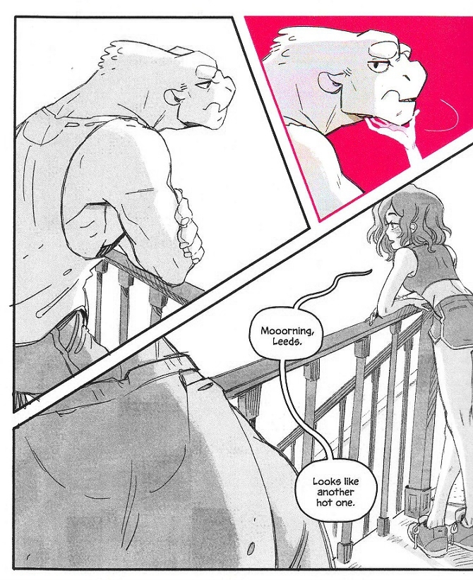
Nao Shizuka X Shesha’s my monster boyfriend can see my feelings UNOFFICIAL FANBOOK. (2019)
Every time you see pink in this book, it is not literal. It is psychological; the big guy there magically senses what other people want from him, and everything pink in this book symbolically reflects that desire. This is a striking effect that I don’t see used often, but it works beautifully, and it doesn’t need much explanation. What I find most interesting about it is that it shows one person’s psyche physically interacting with somebody else, even though it’s not physically real! And we as comics readers just roll with it! The effect is sensual and intimate, not jarring or upsetting.
Sam Kieth, in my opinion, is the master of this reality-mashing effect. He uses it for drama and horror, though, and he’s far less restrained than the Barbarous fanbook, which makes it very clear what is physical and what is psychological. In Zero Girl, though, it’s impossible to know—and that’s on purpose.
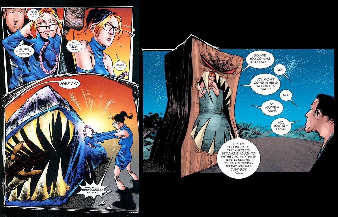
Sam Kieth’s Zero Girl. (2001)
When the titular character is protected by circles and assaulted by squares, there’s no telling how much of what she sees is physical and how much is psychological. Even when other people start seeing the same things she does, the reader may not be. Do the bus and box truly have big pointy teeth? Can the characters truly see them? Or are the box and bus threatening in some other, less obvious way, and the teeth are a visual device for the reader’s benefit? All narrators are unreliable, including the artist.
Also interesting to note is how the panels break from rectangular convention, according to Kieth’s need. When the circle of protection is invoked, the top of the panel curves, but the sides and bottom stay straight and jagged. The box looms so large that it breaks out of its panel!
And yet there is still further to push the envelope! Even Zero Girl keeps the distortion to the environment. How does the effect change when it’s the character being distorted?

Carla Speed McNeil’s Finder: Dream Sequence, pg. 87. (2011)
Here’s my title slide again. Only the character is distorted; the environment remains clear, though it disappears into haze. It’s a different effect, isn’t it? In Zero Girl, we readers don’t know where the distortion of reality is coming from; the whole world seems untrustworthy. In Finder, we know exactly who’s unreliable: the narrator. His head is literally up in the clouds… or the fog, more accurately. What an elegant way to depict dissociative haze! But McNeil pushes things still further, later in the book.
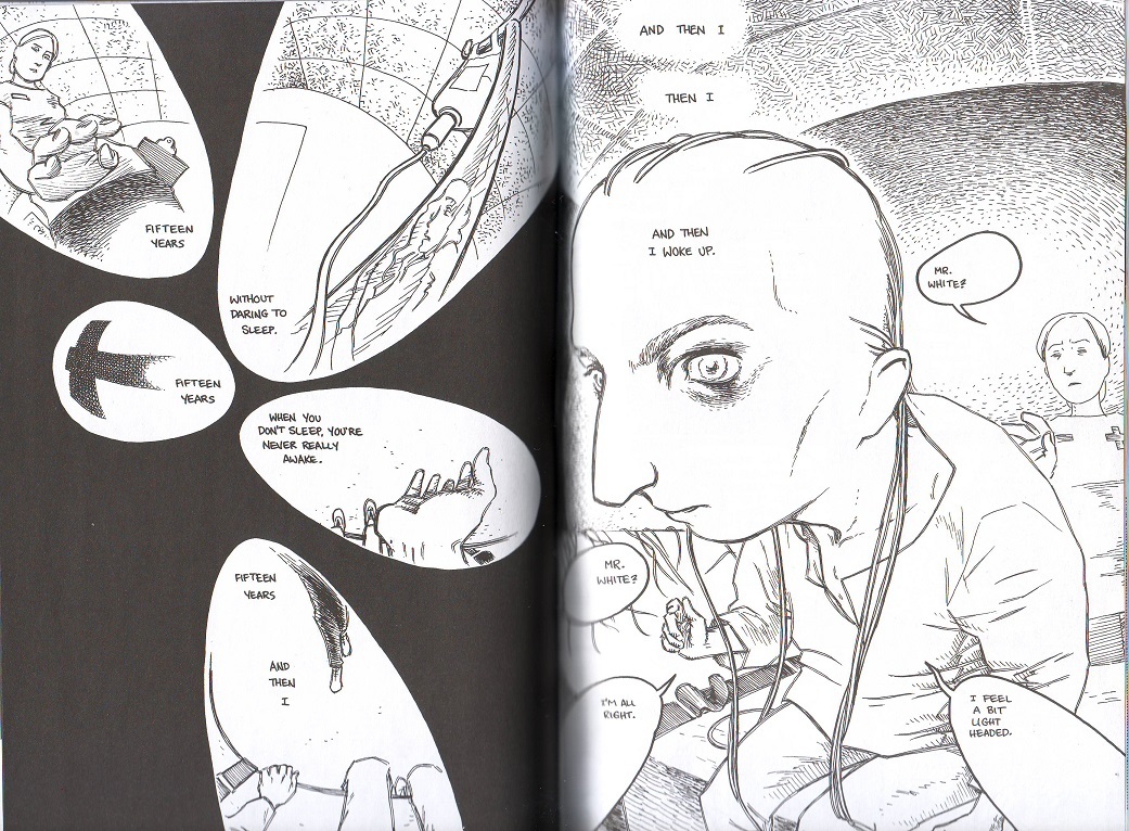
Carla Speed McNeil’s Finder: Dream Sequence, pg. 160-161. (2011).
These pages distort character, panels, and environment all; only the lettering remains straight and “normal” (though the bubbles that house it are warped). The experience is even more disorienting, expressing the confusion of waking up, still groggy. McNeil uses this effect rarely, but it’s unforgettable.
It’s also thematically appropriate. Dream Sequence is about a man who hosts a giant, Second Life-esque computer game within his psyche, only to subconsciously rebel and wreck it. This guy creates his own world; when he’s not well, neither is the environment around (or inside) him. Indeed, a theme of the book is how physical and psychological reality influence each other.
All of these comics I’ve shown so far are genre fiction, often dismissed as beneath study. But the tricks they use are perfect for mental health comics, and indeed, I’ve used them all in my own work! Well, except for the ones that involve color. Color printing is expensive, and I’ve yet to bite that bullet, but that’s okay, Mayday (FKA Dean) Trippe has!
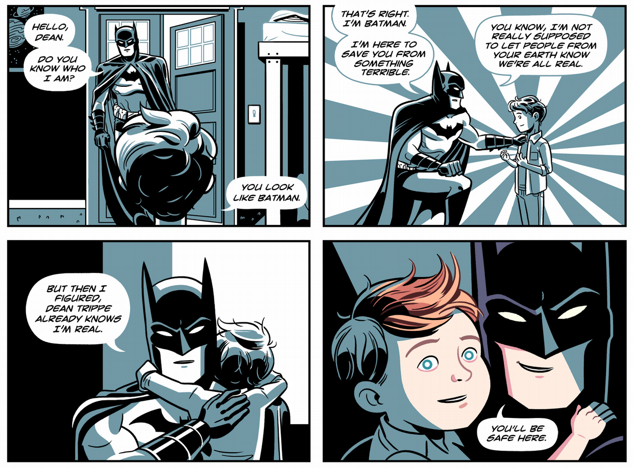
Mayday Trippe’s Something Terrible, page 11. (2013)
Trippe’s autobiographical comic about surviving the unspeakable is overwhelmingly done in black, white, and a blue so desaturated it borders on gray—Batman’s color scheme, stark and gloomy. But Batman is not the source of that gloom—in a beautiful twist of visual irony, he is the bearer of full color, bringing life and healing with it. (This also conveniently delineates the physical world from the mythic.)
We all know that Batman doesn’t literally exist, but nevertheless, he comes and rescues Trippe and helps them heal. Trippe interacts with him, goes from the physical world to the mythic and back again. And what’s more, this is depicted as a good thing, a wondrous thing! The walls of reality aren’t breaking down; they’re opening up like doors, and comics readers don’t bat an eye at this! Something Terrible is considered transgressive for its subject matter, not its use of color or reality-mashing.
Color printing is too expensive for me yet, but I can still use other tricks to depict my own mind, and our own multiplicity. We haven’t taken advantage of each other’s different drawing styles and handwriting so much lately, out of concern of looking inconsistent and sloppy, but readers remark positively on it, so maybe they know something we don’t.
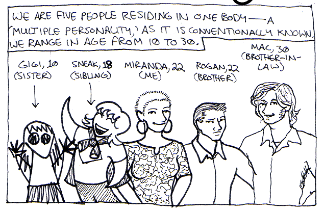
LB Lee’s Questions, page 2. (2010).
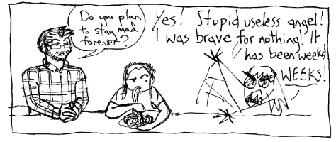
LB Lee’s All In The Family. (2021)
One singlet reader, who said he knew nothing about multiplicity before seeing our work, remarked that this shift in art style from All In The Family was an “aha!” moment for him. Up to that point in the chapter (a stand-alone floppy comic, back in the day), Gigi had been drawing with her kindergarten scribble, which he presumed a stylistic choice… until other headmates started drawing and he realized what was up. It seems to “click” with people more than any exposition or explanation.
We’re still figuring out all the tricks we can do with thought bubbles. With them, we can depict an inner dialogue…

LB Lee’s All In The Family. (2021)
…a memory flashback…
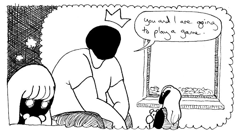
LB Lee’s All In The Family. (2021)
...or commentary by one headmate on the memory of the cloying advice of another.
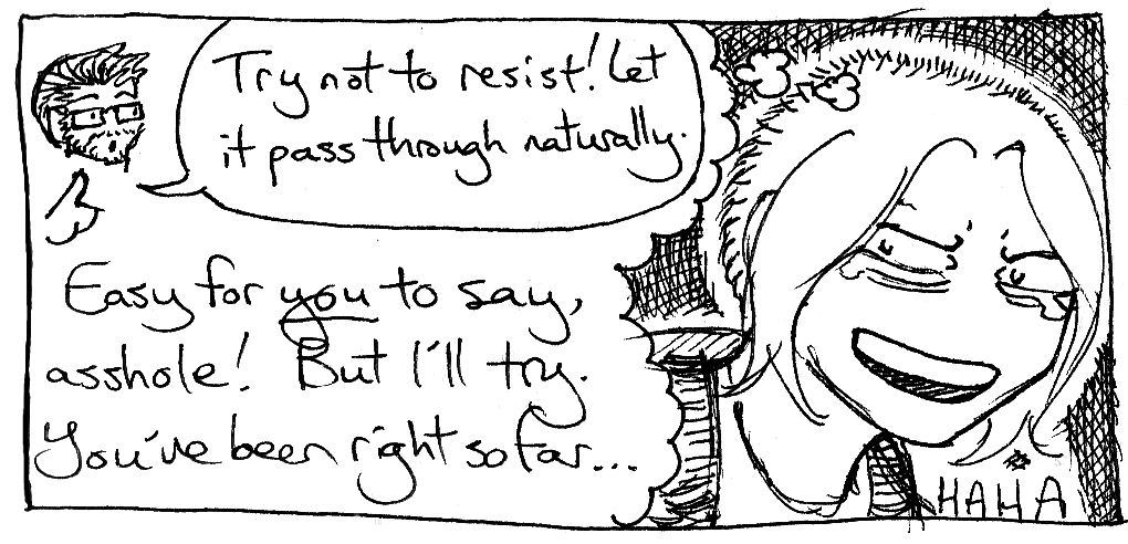
LB Lee’s All In The Family. (2021)
And this is all super mundane compared to that Black Jack waking dream loop! We’ve only touched the surface!
Since I make comics taking place in the physical world, my psychological ones, and in both past and present, one challenge is letting the reader know when and where they are. As a result, I haven’t experimented as much with imprinting psychological effects on environments alone, like Bad Magik or Zero Girl did. About the only time I have is using blackness to represent amnesia in All In the Family. More than that feels like it’d run the risk of being confusing.
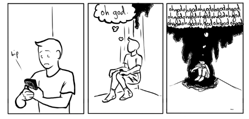
LB Lee’s All In The Family. (2021)
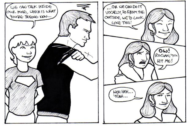
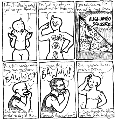
I do a lot of character distortion, though! That’s just obvious and intuitive for the work I do! I’d argue that my work would be an incoherent mess without it! On a logistical level, depicting my relatives with cartoonish, totally unrealistic figures means they can’t be recognized, and thus protects me from harassment or a lawsuit, but we do it for ourself as well. From the very first comic we ever made, we swapped back and forth between depicting our communal meat-suit vessel and our individual self-images.
LB Lee’s MPD for You and Me. (2007)
Which we choose, vessel or self-image, depends on a lot of factors, like: can we all fit in the panel? Is this taking place in a physical or mental world? Is it an “inside looking out” situation, or an “outside looking in”? Are we trying to psychologically distance ourself from the events we’re drawing? Would it be jarring to have one instead of the other? (For example, if I drew my ten-year-old headmate buying booze or driving the car. Even though she can, the reader should never get jolted out of the story to ponder through something like that, unless that’s the point.)
LB Lee’s The Homeless Year (2015)
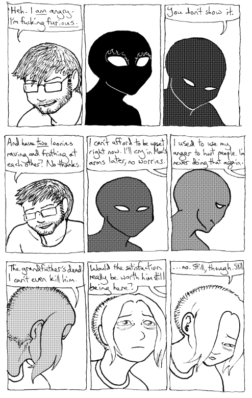
We also distort our depictions of ourself to reflect sanity or emotional state. I mean, why not, we’re distorting our appearance anyway for narrative clarity, why stick with just how we normally appear?
LB Lee’s All In The Family. (2021)
Probably the furthest we ever took this was in the Dissociation chapter of the Homeless Year, with which I meant to communicate the experience of a total dissociative breakdown. As a result, panels, character, environment, even lettering, all go to snot. I even typed up the lettering on an honest-to-god electric typewriter at the library and chopped it up like confetti. I could afford to be experimental, since Dissociation was only 8 pages and a very simple narrative, so there wasn’t much to get confused over. I wouldn’t dare try pulling this on a more complex project.

LB Lee’s Dissociation. (2012)
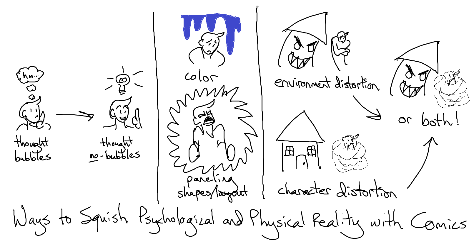
So, to sum up: comics can show psychological experience by bending visual reality. They can do it with color, panel shapes and layout, thought/speech bubbles, distortion of environment or characters, and mashing psychological and physical realities together.
And there’s still so much more that I haven’t explored or found out about yet! I look forward to becoming a more unreliable narrator. Thanks for coming!

Comics Used:
Series: Essay
Summary: Comics’ lack of objectivity, and their ability to visually mash physical and psychological realities together, make them great for depicting the mind.
Word Count: 2800
Notes: A rough transcription of a lecture I gave to Hillary Chute’s Graphic Medicine course at Northeastern University on April 14, 2022 and originally posted for my Patreon folks in... May? Includes images with foul language, Japanese homophobic slang, and naked girls, but nothing worse than you’d see in an art museum. Images are included as illustration, not endorsement.

Carla Speed McNeil’s Finder: Dream Sequence, pg. 87. (2011)
Hello, everybody! We are LB Lee, we make mental health comics, and we’re multiple, so our pronouns are going to be a mess.
For a lot of people, multiplicity is this weird, alien concept. It’s hard for them to wrap their heads around. My job is to take them into my world, to make it seem ordinary and understandable, and comics are great for that! Lack of realism is usually a criticism, but comics’ lack of objectivity makes it the perfect medium for sharing psychological experience through visual art.
When we watch a live-action movie, we assume that what we are seeing is true and real. The camera is presumed to be an unbiased, objective observer, and when it isn’t—like in A Beautiful Mind—the audience is usually surprised. Comics aren’t like that. We know from the get-go that what we’re looking at may not be a one-to-one reflection of reality. It’s obvious; in real life, we aren’t surrounded by bubbles containing our speech or thoughts!

Adam Warren’s Empowered, vol. 4, page 128. (2007)
Thought bubbles have been out of vogue for a while, but these humble balloons deserve more credit. As visual, external representations of individual, invisible psychological experiences, thought bubbles are the core of a lot of the coolest psychological tricks in comics! This one is just a simple gag, but elsewhere in the book, we also get this telepathic character, unable to stop herself from mentally blurting out inconvenient truths. How do her parenthetical asides and differing bubble shapes affect the experience?

Adam Warren’s Empowered, vol. 4, page 101. (2007)
Maybe that’s a little too subtle. These thought bubbles aren’t too far removed from speech. Let’s try this one from volume 10. Just pause here to take it in.

Adam Warren’s Empowered, volume 10, pg. 169. (2017)
Here, we have a depiction of a nightmare being shared via thought bubble, and the guy in the nightmare has his own speech/thought bubble, all black and distorted to show how viscerally “wrong” he is. Even the background is warping around him, and the stark black and white artwork in the dream bubble makes it clear we’re on a different layer of reality. And very little of this needs explaining—you know just by looking at one page/panel.
In volume 11, Warren takes it even further by removing the bubble entirely and showing this guy from his own point of view. We readers get to see the ghost of who he was, trapped in the shell of what he’s become, distorting everything he says and does. This panel and dialogue isn’t witnessed by any of the characters; it is purely for the reader, giving us as inside look at an otherwise horrifying, one-note evil character. Warren is less interested in what this character does than why and how he got to be this way.

Adam Warren’s Empowered, vol. 11, page 186. (2019)
I call this a perspective of “inside looking out,” rather than “outside looking in.” It is hugely important for building psychological understanding and compassion. Prose can do it too, but through language, rather than visuals.
Probably the most elaborate version of the speech/thought bubble I’ve seen is this one from Osamu Tezuka’s Black Jack. Look at it! (And don’t forget to read it in Japanese order, from top to bottom, right to left.)

Osamu Tezuka’s Black Jack, vol. 2, pg. 251. (2008)
What an elegant, entertaining way to show looping dreams of waking up! Thanks to the page layout (and Japanese reading order) the reader doesn’t realize the character is dreaming until she does, over and over again. And you aren’t confused as to whether she’s still dreaming in future pages, because the whole sequence is contained within the same page, with a concrete beginning and end. I’ve read other comics where the loop spreads across multiple pages, and since it lacks clear beginning or end, the reader is left uncertain as to when the dream loop stops. (Though, depending on the creator’s goal, that uncertainty and discomfort might be the point.)
The next obvious step is to remove the thought bubble entirely, letting the thought or experience float without a clear barrier. How does that effect the message? These panels that use it very subtly. Depending on your screen contrast, you may not even see the wolf jaws in the second panel, closing around the character’s head. (In the web version, the wolf jaws are apparently done in red, helping them stand out more, but I couldn’t get my hands on that, so you get the crummy scan from my paper copy. Sorry.)

Mancameron’s Bad Magik, chapter 1. (n.d)
We all know that those wolf jaws do not literally exist, even if they aren’t walled off in a bubble. They’re barely visible, blended into the gray tones of the background, representing a nagging feeling, a free-floating anxiety, a narrowing of options, not a clear verbal thought or a cinematic image. It’s a very different effect, emotionally.
That moment is played for drama. Played for comedy, and way less subtle, is this gag, which requires a little bit of explanation and translation from Japanese. (Read this too in Japanese order, and apologies for the poor quality scanlation; the professional translation is long out of print and I couldn’t get my hands on it in time.)

Yasuko Aoike’s From Eroica With Love, volume 2, chapter 4, page 40. (1978)
A rice pot (or “okama”) is Japanese slang for an effeminate gay man, transvestite, or trans woman, while roses (or “bara”) is old-fashioned slang that roughly translates to “pansy” in Japan. (In English-speaking online worlds, the word means something very different.) In other words, this character has just been clocked and realizes it.
Here, the psychological effect isn’t hidden away in the background, but even though the rice pot full of roses is drawn just like all the “real” things in the panels, we still know it’s figurative. It has no lasting effect, isn’t mentioned by any of the characters, and disappears as suddenly as it arrives. And even without the cultural context, an American might be familiar enough with the idea of the light-bulb (or the anvil) over someone’s head to guess roughly what they’re seeing. A more subtle, wolf-jaw styling wouldn’t work; this is not a subtle realization! It hits like a stack of bricks. But we, the readers, still know that it exists only psychologically—at least, as long as we know what the symbol means. As I recall, the official translation didn’t bother to explain the joke, which must have been perplexing for context-free readers.
Both From Eroica With Love and the print version of Bad Magik rely on context to tell what is real and what isn’t, and the visual symbols are private ones; other characters don’t see them. This unofficial Barbarous fanbook, though, more clearly delineates the psychological from the physical, using color!

Nao Shizuka X Shesha’s my monster boyfriend can see my feelings UNOFFICIAL FANBOOK. (2019)
Every time you see pink in this book, it is not literal. It is psychological; the big guy there magically senses what other people want from him, and everything pink in this book symbolically reflects that desire. This is a striking effect that I don’t see used often, but it works beautifully, and it doesn’t need much explanation. What I find most interesting about it is that it shows one person’s psyche physically interacting with somebody else, even though it’s not physically real! And we as comics readers just roll with it! The effect is sensual and intimate, not jarring or upsetting.
Sam Kieth, in my opinion, is the master of this reality-mashing effect. He uses it for drama and horror, though, and he’s far less restrained than the Barbarous fanbook, which makes it very clear what is physical and what is psychological. In Zero Girl, though, it’s impossible to know—and that’s on purpose.

Sam Kieth’s Zero Girl. (2001)
When the titular character is protected by circles and assaulted by squares, there’s no telling how much of what she sees is physical and how much is psychological. Even when other people start seeing the same things she does, the reader may not be. Do the bus and box truly have big pointy teeth? Can the characters truly see them? Or are the box and bus threatening in some other, less obvious way, and the teeth are a visual device for the reader’s benefit? All narrators are unreliable, including the artist.
Also interesting to note is how the panels break from rectangular convention, according to Kieth’s need. When the circle of protection is invoked, the top of the panel curves, but the sides and bottom stay straight and jagged. The box looms so large that it breaks out of its panel!
And yet there is still further to push the envelope! Even Zero Girl keeps the distortion to the environment. How does the effect change when it’s the character being distorted?

Carla Speed McNeil’s Finder: Dream Sequence, pg. 87. (2011)
Here’s my title slide again. Only the character is distorted; the environment remains clear, though it disappears into haze. It’s a different effect, isn’t it? In Zero Girl, we readers don’t know where the distortion of reality is coming from; the whole world seems untrustworthy. In Finder, we know exactly who’s unreliable: the narrator. His head is literally up in the clouds… or the fog, more accurately. What an elegant way to depict dissociative haze! But McNeil pushes things still further, later in the book.

Carla Speed McNeil’s Finder: Dream Sequence, pg. 160-161. (2011).
These pages distort character, panels, and environment all; only the lettering remains straight and “normal” (though the bubbles that house it are warped). The experience is even more disorienting, expressing the confusion of waking up, still groggy. McNeil uses this effect rarely, but it’s unforgettable.
It’s also thematically appropriate. Dream Sequence is about a man who hosts a giant, Second Life-esque computer game within his psyche, only to subconsciously rebel and wreck it. This guy creates his own world; when he’s not well, neither is the environment around (or inside) him. Indeed, a theme of the book is how physical and psychological reality influence each other.
All of these comics I’ve shown so far are genre fiction, often dismissed as beneath study. But the tricks they use are perfect for mental health comics, and indeed, I’ve used them all in my own work! Well, except for the ones that involve color. Color printing is expensive, and I’ve yet to bite that bullet, but that’s okay, Mayday (FKA Dean) Trippe has!

Mayday Trippe’s Something Terrible, page 11. (2013)
Trippe’s autobiographical comic about surviving the unspeakable is overwhelmingly done in black, white, and a blue so desaturated it borders on gray—Batman’s color scheme, stark and gloomy. But Batman is not the source of that gloom—in a beautiful twist of visual irony, he is the bearer of full color, bringing life and healing with it. (This also conveniently delineates the physical world from the mythic.)
We all know that Batman doesn’t literally exist, but nevertheless, he comes and rescues Trippe and helps them heal. Trippe interacts with him, goes from the physical world to the mythic and back again. And what’s more, this is depicted as a good thing, a wondrous thing! The walls of reality aren’t breaking down; they’re opening up like doors, and comics readers don’t bat an eye at this! Something Terrible is considered transgressive for its subject matter, not its use of color or reality-mashing.
Color printing is too expensive for me yet, but I can still use other tricks to depict my own mind, and our own multiplicity. We haven’t taken advantage of each other’s different drawing styles and handwriting so much lately, out of concern of looking inconsistent and sloppy, but readers remark positively on it, so maybe they know something we don’t.

LB Lee’s Questions, page 2. (2010).

LB Lee’s All In The Family. (2021)
One singlet reader, who said he knew nothing about multiplicity before seeing our work, remarked that this shift in art style from All In The Family was an “aha!” moment for him. Up to that point in the chapter (a stand-alone floppy comic, back in the day), Gigi had been drawing with her kindergarten scribble, which he presumed a stylistic choice… until other headmates started drawing and he realized what was up. It seems to “click” with people more than any exposition or explanation.
We’re still figuring out all the tricks we can do with thought bubbles. With them, we can depict an inner dialogue…

LB Lee’s All In The Family. (2021)
…a memory flashback…

LB Lee’s All In The Family. (2021)
...or commentary by one headmate on the memory of the cloying advice of another.

LB Lee’s All In The Family. (2021)
And this is all super mundane compared to that Black Jack waking dream loop! We’ve only touched the surface!
Since I make comics taking place in the physical world, my psychological ones, and in both past and present, one challenge is letting the reader know when and where they are. As a result, I haven’t experimented as much with imprinting psychological effects on environments alone, like Bad Magik or Zero Girl did. About the only time I have is using blackness to represent amnesia in All In the Family. More than that feels like it’d run the risk of being confusing.

LB Lee’s All In The Family. (2021)
I do a lot of character distortion, though! That’s just obvious and intuitive for the work I do! I’d argue that my work would be an incoherent mess without it! On a logistical level, depicting my relatives with cartoonish, totally unrealistic figures means they can’t be recognized, and thus protects me from harassment or a lawsuit, but we do it for ourself as well. From the very first comic we ever made, we swapped back and forth between depicting our communal meat-suit vessel and our individual self-images.

LB Lee’s MPD for You and Me. (2007)
Which we choose, vessel or self-image, depends on a lot of factors, like: can we all fit in the panel? Is this taking place in a physical or mental world? Is it an “inside looking out” situation, or an “outside looking in”? Are we trying to psychologically distance ourself from the events we’re drawing? Would it be jarring to have one instead of the other? (For example, if I drew my ten-year-old headmate buying booze or driving the car. Even though she can, the reader should never get jolted out of the story to ponder through something like that, unless that’s the point.)

LB Lee’s The Homeless Year (2015)
We also distort our depictions of ourself to reflect sanity or emotional state. I mean, why not, we’re distorting our appearance anyway for narrative clarity, why stick with just how we normally appear?

LB Lee’s All In The Family. (2021)
Probably the furthest we ever took this was in the Dissociation chapter of the Homeless Year, with which I meant to communicate the experience of a total dissociative breakdown. As a result, panels, character, environment, even lettering, all go to snot. I even typed up the lettering on an honest-to-god electric typewriter at the library and chopped it up like confetti. I could afford to be experimental, since Dissociation was only 8 pages and a very simple narrative, so there wasn’t much to get confused over. I wouldn’t dare try pulling this on a more complex project.

LB Lee’s Dissociation. (2012)
So, to sum up: comics can show psychological experience by bending visual reality. They can do it with color, panel shapes and layout, thought/speech bubbles, distortion of environment or characters, and mashing psychological and physical realities together.

And there’s still so much more that I haven’t explored or found out about yet! I look forward to becoming a more unreliable narrator. Thanks for coming!

Comics Used:
- Aoike, Yasuko. (1978; fan-translation n.d.) From Eroica With Love, volume 2. CMX Books. (Official translation is long out of print, but you can still find these ancient bootlegs on Library Genesis.)
- Kieth, Sam. (2001). Zero Girl. DC Comics.
- Lee, LB. (2007). MPD for You and Me. Self-published. Retrieved from http://healthymultiplicity.com/loonybrain/Comics/MPD/MPD01.html
- Lee, LB. (2010). Questions. Self-published. Retrieved from https://healthymultiplicity.com/loonybrain/Comics/Questions/Questions01.html
- Lee, LB. (2015). The Homeless Year. Self-published. Buy here: https://healthymultiplicity.com/loonybrain/ShopHome.html
- Lee, LB. (2021). All In The Family: the complete collection. Lenticule Press. Buy here: https://healthymultiplicity.com/loonybrain/ShopHome.html
- Mancameron. (n.d) Bad Magik, chapter 1. Self-published. The grayscale print version I own seems to be out of print; the digital version (with red) can be read on https://www.orgymania.net/ (Heads up: Bad Magik is a porn comic. Orgymania.net is a porn site.)
- McNeil, Carla Speed. (2011). The Finder Library, volume 2. Dark Horse Books.
- Nao Shizuka X Shesha. (2019). my monster boyfriend can see my feelings UNOFFICIAL FANBOOK. Self-published. Seems to be out of print, cannot find it for sale anywhere, but you can read the webcomic it's based on, Barbarous, at http://www.johnnywander.com/comic/archive/storyline-24
- Tezuka, Osamu. (2008). Black Jack, vol. 2. Vertical, Inc.
- Trippe, Mayday. (2013). Something Terrible. Iron Circus. Wow, jeez, apparently this book is impossible to buy anywhere now too, except secondhand on Amazon. It wasn't when I did this talk...
- Warren, Adam. (2007). Empowered, volume 4. Dark Horse Books. Retrieved from https://www.empoweredcomic.com/
- Warren, Adam. (2017). Empowered, volume 10. Dark Horse Books. Retrieved from https://www.empoweredcomic.com/
- Warren, Adam. (2019). Empowered, volume 11. Dark Horse Books. Retrieved from https://www.empoweredcomic.com/
no subject
Really cool stuff. I haven't thought about it much but now that you point it out, it's everywhere and very intuitive. Even in Hikaru no Go, the illustrations easily clarify that Sai is not physically present but he's always there by his side, and there's no confusion with readers about that. It's how I experience my headmates as well.
--Janusz
no subject
A lot of this stuff is only noticeable when it fails. When it works well, it's invisible. Sort of how you only notice comics lettering or paneling when it really, really flunks out.
--Rogan